How to Choose the Right Chart for Your Data
Data visualization is an essential skill in the modern world. Whether you are working on a business presentation, an academic report, or a personal project, being able to communicate your data clearly and effectively can make all the difference. Charts and graphs are visual tools that help us summarize, organize, and present data in ways that are easy to understand and interpret. With the right chart, you can highlight trends, patterns, and insights that might otherwise go unnoticed in a table of numbers. However, with so many different types of charts available, it can be overwhelming to know which one to use for your data. In this article, we’ll cover how to choose which chart to use for your data. We’ll discuss the most common chart types, when to use them, and tips to make your data visualization more effective.
Identify What Kind of Data You Have
Data can be qualitative (categorical) or quantitative (numerical). Examples of qualitative data include colors, names, brands, or regions. Quantitative data, on the other hand, deals with numbers and measurable quantities such as height, weight, price, or temperature. Identifying what kind of data you have will help you choose a chart that can display that type of information. For example, bar charts are great for categorical data, while line charts are better suited for showing trends in numerical data over time. It also helps to know if your data is continuous or discrete, ordinal or nominal.
Know Your Goal and Message
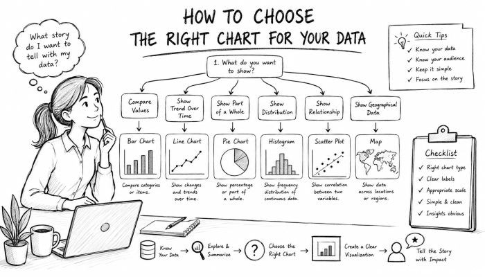
Before you jump into creating charts, know why you are making them and what story you want to tell. Whether you want to compare values, show proportions, track changes over time, or identify relationships, there’s a chart out there that can help you visualize your data. For example, if your goal is to show how sales have increased over several months, you may want to use a line chart to demonstrate that upward trend. Pie charts work well when you need to show how different parts contribute to a whole. Having a clear message in mind will help you choose the right visual representation so that your data doesn’t get lost in translation.
Bar Charts
Bar charts are one of the most common types of charts. They use rectangular bars to represent data values visually. The length or height of each bar corresponds to the data value it represents. Bars can be displayed vertically or horizontally depending on the data being represented. Bar charts work best when you want to compare discrete data such as survey results, population by country, or sales by product category. They are also great when you have multiple bars to display. Avoid using bar charts if you have too many categories or continuous data.
Line Charts
Line charts are best used when you want to show trends over time. They use points connected by lines to track changes in values at regular intervals. Line charts work best for financial data, temperature changes, website traffic, or anything that is tracked over time. They allow you to display multiple data series on the same chart, which makes it easy to compare trends between datasets. Line charts require time-based data with equal intervals between each point. Avoid using line charts when dealing with categorical data or too many data series on one chart as this will clutter your visualization.
Pie Charts
Pie charts display data as sections of a circle where each slice represents a proportion of the total pie. Pie charts are best used when you want to show percentage or proportionate relationships between different parts of a whole. Examples include market share breakdowns, budget allocations, or survey results. Pie charts work well when you have limited categories that add up to 100%.
Scatter Plots
Scatter plots are used to plot data points on a horizontal and vertical axis. They are best suited for showing relationships between two variables and identifying patterns such as correlations, clusters, or outliers. Scatter plots are commonly used in scientific fields such as biology or physics. In finance, scatter plots can be used to plot price against volume to identify trading patterns. Scatter plots allow you to display multiple data series using colors and can even include trend lines.
Histograms
Histograms are similar to bar charts but are used to display the distribution of numerical data. Histograms group data into ranges and plot the number of data points that fall into each range. They help you understand the shape, spread, and central tendencies of your data distribution. Histograms are commonly used in statistics to identify skewness, outliers, or modality of your data. Unlike bar charts, histograms only work with continuous data.
Area Charts
Area charts are line charts where the area between the line and the axis is filled. They are best used when you want to show how a total changes over time and how it is broken down into segments. Area charts work well when you want to emphasize volume or when your data has multiple layers that stack on top of each other. They are often used to show total sales alongside segments of different product lines. Avoid using area charts when your data has too many categories as this will clutter your chart.
Heatmaps
Heatmaps display data across two dimensions using colors to represent values. They are useful for identifying patterns or density within large datasets. Heatmaps are commonly used to represent website click maps, geographical data, or even correlation matrices. They work best when you want to show variations in intensity across a given area.
Choosing Chart Colors and Style
When creating charts, it’s important to pay attention to colors and styles. Colors can help differentiate between data series, while styles can make your charts more readable. You should avoid using bright colors that distract from your data. Instead, use contrasting colors that are easy on the eyes. Labels and font sizes are also important when creating charts. Your labels should be easy to read and large enough to be seen. You should also maintain consistency in styles when creating multiple charts for a report.
Avoid These Chart Practices
3D charts tend to distort data and should be avoided. Too many gridlines can make your charts look cluttered. Truncated axes can also mislead readers by exaggerating trends. Always label your axes with appropriate units of measure. Misleading aggregation can hide data variability so always question hidden summaries. Finally, test your charts on different devices to ensure they are easy to read.
Use Software and Tools to Create Charts
Thankfully, there are various tools and software that make creating charts easy. Microsoft Excel, Google Sheets, and other spreadsheet programs have built-in charting tools. More advanced software such as Tableau and Power BI allow you to create interactive and dynamic charts. Knowing which tool to use and its limitations can help you create better charts.
Conclusion
Knowing how to choose which chart to use for your data is key to effective data visualization. By identifying your data type, knowing your message, and using the appropriate charts, you can make data easily understood by anyone who reads it. Use bar charts for comparing categories, line charts for showing trends over time, and pie charts for proportional relationships. Scatterplots are great for relationships while histograms help you understand data distribution. Area charts work best when you want to show volume changes over time while heatmaps are ideal for visualizing densities. Remember to use colors wisely, keep styles consistent, and avoid bad chart practices. Finally, take advantage of software and tools that can help you create great charts.
 How to Make the Most of Your Holiday Break
 The Best Winter Destinations for a Cozy Getaway
 How to Organize Your Holiday Travel Plans with Ease
 The Ultimate Guide to Cooking for a Crowd
 How to Make Healthy Comfort Food Without the Guilt
 5 Delicious Vegan Breakfast Ideas You Can Make in Minutes