Exploratory Data Analysis (EDA) Techniques
Before you build any models, have any assumptions about your dataset, or think about how you might preprocess your data: you need to explore it. The field of data science would be utterly useless if we didn’t know how to extract meaning from data. While there are differing opinions on how to properly perform Exploratory Data Analysis, most analysts can agree that understanding what your data looks like, is what, will ensure your models will be both accurate and interpretable.
Know Why You Are Exploring Your Data
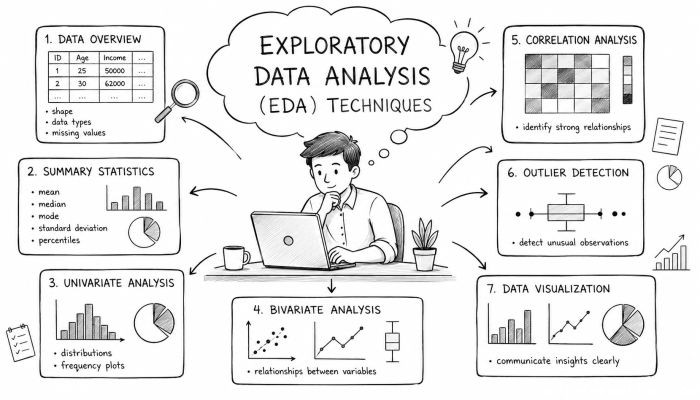
EDA, or exploratory data analysis, allows you to understand the structures, variables, and distributions within your dataset. EDA is used to:
Summarize Main Characteristics with the Help of Quantitative and Visual Methods
Find the Underlying Patterns in Data
Detect any obvious anomalies that might exist
Test Hypotheses
EDA is best used to ensure that your data is of high quality. Using descriptive statistics and data visualization will allow you to ask and answer questions about your dataset and know what type of processing you need to do before any formal modeling begins.
Obtain or Create your Dataset
Okay, so you’ve realized you need to perform EDA on your dataset. The first thing you need to do is, well, get your data. Once you have obtained the data you wish to analyze, take the time to ensure that you know where it came from and that the structure and format of the data is correct. Make sure that you know what each column represents. Take note of which variables are categorical vs numeric vs dates. Look over your dataset and familiarize yourself with it.
Descriptive Statistics
Familiarize yourself with the common descriptive statistics. They include the mean, median, mode, standard deviation, variance, minimum and maximum. Reviewing each of these statistics will allow you to understand how your data is distributed. Are your variables skewed? Do you have any outliers? Learning about your data will allow you to choose the appropriate methods to analyze it.
Data Visualization
Visualization is one of the most powerful tools you can use to understand your data. There are many types of visualizations you can perform, but we’ll cover the main ones. Use histograms to visualize the distribution of your numeric variables. Boxplots show you the distribution of your variables using the 5 number summary. Scatterplots are great to use when you want to visualize the relationships and groupings between your numeric variables. Bar charts are the go-to plot when you want to make comparisons between levels of your categorical variables.
Missing Values
Real world data is almost never clean and ready for use. There will more than likely be someNAvalues that you will need to deal with. Take note of how much missing data is in your dataset as well as how much missing data is in each column. Visualize where your missing values are located. Remove them, fill them in, or flag them. Missing values shouldn’t be ignored!
Outliers
Outliers are data points that do not fall into the distribution of the rest of your data. They can cause significant skewness and can affect the mean and standard deviation of your variables. You should always check for outliers and decide what to do with them.
Univariate Analysis
Performing univariate analysis allows you to understand each variable individually. Take each variable, one at a time and understand what it represents. Plot histograms and kernel density estimates to get a sense of the distribution of your data. Calculate summary statistics for each numeric variable. Explore each categorical variable and visualize the number of occurrences of each “level.”
Bivariate Analysis
Once you’ve understood your variables individually, it’s time to learn how they interact with each other. If both of your variables are numeric, create a scatterplot. One of your variables is categorical and the other is numeric? Plot a boxplot. Both of your variables are categorical? Plot a stacked bar chart. Understanding how your variables interact with one another can help you decide what variables are important, and which you can do without.
Multivariate
Multivariate data analysis is similar to bivariate analysis, however you’ll be comparing three or more variables at a time. You can create pair plots to visualize every variable compared with every other variable.
Cluster Analysis
Principal Component Analysis (PCA)
Feature Engineering/Creation
Now that you’ve explored your dataset, you should have a good idea of any additional features you can create to prepare your data for modeling.
Try an Automatic EDA Report
There are new libraries that allow you to create automated EDA reports. These include pandas profiling, Sweetviz, and AutoViz. Take 5 minutes and see what these packages come up with. You’ll be amazed at how much you can learn about your data by simply looking at the visualization and summary statistics that are produced.
Document Your Work
When you’re finished with your EDA, make sure you save your notebook or create a dashboard that highlights the visualizations you created. Documenting your EDA process is extremely important when sharing your results with others.
Conclusion
EDA is one of, if not the most important step in analyzing your data. There are many techniques that you can use. Some of which were listed above. As you gain more experience, you’ll learn other methods. The key is to understand your data! No two EDA’s will be the same.
 The Importance of Fostering Creativity in Education
 How to Plan a Family Movie Night Everyone Will Enjoy
 How to Navigate Parenting in the Digital Age
 How to Stay Sane During Family Holiday Gatherings
 How to Create a Family Calendar for Better Time Management
 How to Encourage Your Child to Be Independent and Responsible