The Influence of Color Psychology in Design
Color psychology studies the impact of colors on human feelings and actions as well as their perceptions. Designers need to understand these effects to create effective visuals as well as environments and products. Through this blog readers will learn about color psychology principles and how designers use these principles to craft user experiences that meet specific goals.
The Basics of Color Psychology
What Is Color Psychology?
The study of color psychology explores the impact of various colors on people's psychological and emotional well-being. Color impacts vary according to personal experiences and the cultural and environmental settings people live in.
The Science Behind Color Perception
Biological Responses: Exposure to colors can produce physiological reactions including elevated heart rates or feelings of relaxation.
Cultural Influences: People's understanding of colors is shaped by their society's norms and traditional beliefs.
Personal Associations: People's individual experiences determine their unique reactions to different colors.
The Emotional and Psychological Effects of Colors
Warm Colors
Red: Associated with passion, energy, and urgency. Commonly used to grab attention.
Orange: Conveys enthusiasm, creativity, and warmth. Often used in friendly and energetic designs.
Yellow: Symbolizes happiness, optimism, and caution. Yellow creates an energetic atmosphere yet can lead to eye strain when overused.
Cool Colors
Blue: Represents trust, calmness, and professionalism. Widely used in corporate and healthcare designs.
Green: Associated with growth, harmony, and nature. Often used to convey eco-friendliness or tranquility.
Purple: Evokes luxury, creativity, and mystery. Common in branding for premium products.
Neutral Colors
Black: Signifies sophistication, power, and elegance. Frequently used in modern and high-end designs.
White: Represents purity, simplicity, and cleanliness. Commonly used to create minimalist designs.
Gray: Conveys balance, neutrality, and professionalism. Gray serves as a background or complementary color in many designs.
Applications of Color Psychology in Design
Branding and Marketing
Building Brand Identity
Specific color schemes help businesses form brand recognition while expressing core values. The color red creates excitement as seen in Coca-Cola branding while blue generates trust such as demonstrated by Facebook's color scheme.
Influencing Consumer Behavior
Color can drive purchasing decisions. Yellow triggers appetite stimulation which explains its prevalent use in food industry designs.
Web and User Interface Design
Navigation: Website navigation relies on colors to highlight important elements and direct users toward calls-to-action.
Accessibility: Designers use color contrast to improve readability and usability for users of all types.
Interior Design
Colors influence mood and functionality in spaces. Bedrooms benefit from cool tones that support relaxation whereas living areas gain energy from warm tones.
Product Design
Products receive their perceived quality and purpose from the colors chosen for them. Products for children frequently feature bright and bold colors while professionals prefer muted tones.
Cultural and Contextual Considerations
Global Differences
- The color white represents purity in Western cultures but signifies mourning in certain Eastern cultures.
- The color red represents prosperity in China but serves as a warning signal in Western nations.
Contextual Relevance
Different emotions arise from the same color when it is applied in unique ways. Blue generates a sense of relaxation in medical environments yet represents reliability when used in business logos.
Challenges in Using Color Psychology
Subjectivity
People respond differently to colors because of individual variations.
Overgeneralization
Designs become ineffective when they assume that colors produce universal effects.
Balancing Aesthetics and Functionality
Designers need to create a balance between how colors affect people psychologically and their functional aspects including readability and brand alignment.
Future Trends in Color Psychology and Design
Advances in Technology
Data analytics and AI provide designers valuable insights into audience color preferences and their effects.
Sustainable Design
A growing trend shows that eco-friendly colors and materials are now more common due to worldwide sustainability concerns.
Personalization
Digital interface color schemes can be personalized to match user preferences and improve their overall experience.
Conclusion
Design relies on color psychology to influence emotions while directing behavior and improving functionality. Designers who acquire knowledge of color psychology principles and apply this understanding intentionally can develop designs that communicate effectively to varied audiences. Color design will keep evolving alongside technological progress and cultural changes.
 The Best Travel Gadgets You Can’t Live Without
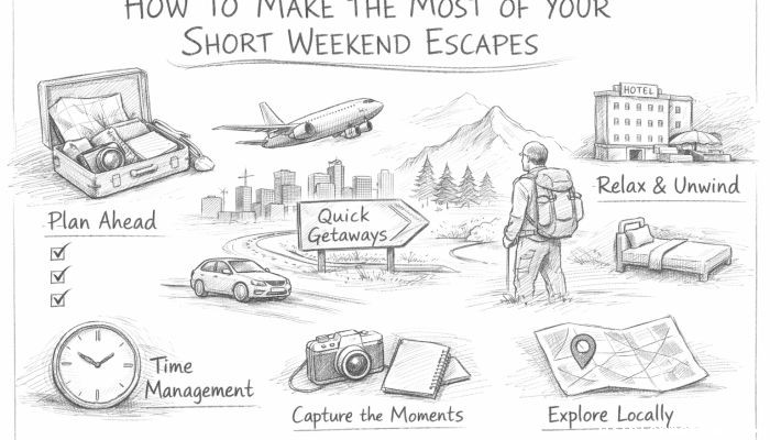 How to Make the Most of Your Short Weekend Escapes
 10 Epic Train Journeys You Should Experience
 How to Find Off-the-Beaten-Path Destinations for Your Next Trip
 How to Maximize Fuel Efficiency for Long Road Trips
 The Ultimate Guide to Car Detailing: Step-by-Step