How to Visualize Real-World Projects Using DevOps in 2025
In 2025, DevOps has moved past its early adoption phase to become a foundational pillar of the enterprise, driving new ways of working, transforming software delivery, and ultimately, reshaping business strategy. However, one ongoing challenge remains the same across all teams and use cases: visualizing real-world DevOps projects in a way that provides transparency, alignment, and predictability.
Whether you’re leading a distributed, cross-functional engineering team; rolling out DevOps to global branches, locations, and remote employees; working on digital transformation initiatives; or reimagining what DevOps can mean for a fast-paced product company, visualization has become the glue that unifies your pipelines, workflows, and stages—and keeps your people focused on the work that matters most.
In this article, we’ll share how DevOps visualization looks different in 2025, highlight the modern tools and approaches that are powering the future of DevOps, and offer concrete examples, frameworks, and best practices for bringing visualization to real-world projects so you can deliver faster, collaborate better, and achieve more meaningful outcomes for your customers.
Let’s get started with the power of visualization and why it’s become such an essential part of DevOps today.
- Why Visualization Has Become Essential in DevOps (2025 Perspective)
- The Evolution of DevOps Visualization Tools
- Mapping Real-World Pipelines Using Value Stream Visualization
- Using Pipeline-as-Code Diagrams for True Transparency
- Visualizing Infrastructure Through IaC and Cloud Architecture Mapping
- Monitoring and Observability Dashboards: Beyond Traditional Metrics
- Visual Collaboration and Whiteboarding in Hybrid Teams
- Scenario-Based Visualization for Risk Management
- Using Visualization for CI/CD Release Strategies
- Visualizing Security Across the DevSecOps Pipeline
- AI and Predictive Visualization: The Future of DevOps Insight
- Connecting Business KPIs with DevOps Visualizations
- Conclusion: Bringing DevOps Visualization to Life in 2025
- More Related Topics
Why Visualization Has Become Essential in DevOps (2025 Perspective)
The software delivery ecosystem is more complex and interconnected than ever, and visualizing your entire pipeline from start to finish is an invaluable skill. Visualization in DevOps has expanded beyond dashboards and graphs—it’s become a universal language shared between developers, operations, QA, product, and even business executives.

In 2025, everyone in the organization—especially those on distributed, hybrid, cross-functional teams—relies on visual layouts for getting context at a glance about work in progress, dependencies, blockers, automated workflows, and deployment readiness. The shift to real-time visibility has revolutionized decision-making across organizations, enabling faster troubleshooting and reducing friction across the entire pipeline.
The Evolution of DevOps Visualization Tools
From Jenkins pipelines to manual Kanban boards to tool-agnostic solutions in between, visualization tools have come a long way over the last decade. Today’s software (GitHub Actions, GitLab CI/CD, Azure DevOps, Harness, etc.) comes with built-in predictive insights, anomaly detection, and visual dependency maps. You can see your work’s end-to-end journey from code commit all the way through to production deployment.
In 2025, visualization has become interactive, collaborative, and powered by machine learning in ways we didn’t think possible just a few years ago. It’s enabled teams to detect failures faster, document their pipelines better, and align their technical work more closely with business goals than ever before.
Mapping Real-World Pipelines Using Value Stream Visualization
Value stream mapping is a classic visualization technique that has been repurposed for DevOps use cases. It’s the act of diagramming every stage of your pipeline from concept all the way to deployment, then using this map to identify bottlenecks, inefficiencies, and waste.
For real-world projects, value stream mapping has become one of the most practical, actionable forms of visualization available, especially when combined with modern tooling that automatically updates value stream maps as you change your processes (eliminating manual maintenance).
Using Pipeline-as-Code Diagrams for True Transparency
Pipeline-as-code has made creating repeatable, scalable workflows easier than ever, but it becomes even more powerful when converted into a visual diagram. Today, platforms can automatically generate interactive charts that visualize stages, jobs, triggers, and dependencies by reading your pipeline-as-code configurations.
For complex real-world projects that involve branching strategies, approvals, deployments, and multi-tiered microservice architectures, pipeline-as-code diagrams are critical for transparency and making sense of how code moves through your system and where risks may lie.
Visualizing Infrastructure Through IaC and Cloud Architecture Mapping
Infrastructure-as-Code (IaC) tools like Terraform, Pulumi, and AWS CDK have matured to the point where infrastructure can be version-controlled, configured, and automated in the same way code is written. In 2025, visualization tools that can convert IaC manifests into cloud architecture diagrams have become essential, instantly showing compute resources, security groups, networks, containers, storage layers, and more.
The impact of visualization on real-world projects has been huge. Instead of relying on text-based configuration files and command-line outputs, teams can now visualize entire environments, compare staging vs. production, and forecast future infrastructure behavior before committing changes to eliminate guesswork.
Monitoring and Observability Dashboards: Beyond Traditional Metrics
Observability platforms have also changed the game in monitoring and visualization. Solutions like Grafana, Datadog, New Relic, and OpenTelemetry have extended beyond traditional metrics such as CPU and memory utilization to provide unified views of performance, logs, traces, user behavior, and overall system health.
Visualization in monitoring and observability is essential to DevOps real-world projects, as it helps teams see how code performs under real traffic conditions, visualize bottlenecks, and understand regressions. In 2025, we are also seeing adaptive dashboards, which means they dynamically adjust layout based on anomalies detected by AI (putting the most important failures front and center).
Visual Collaboration and Whiteboarding in Hybrid Teams
Hybrid work has redefined how teams plan and work on DevOps projects. Visual collaboration tools and whiteboarding (Miro, Figma, Jamboard, Notion, etc.) have become essential for teams building architecture diagrams, designing workflows, and sprint planning, enabling real-time collaboration between engineers, designers, product managers, and other key stakeholders.
For real-world DevOps projects, visualization ensures that everyone remains aligned—despite some decisions inevitably being made asynchronously across time zones.
Scenario-Based Visualization for Risk Management
One of the most innovative trends in DevOps visualization in 2025 is the emergence of scenario visualization. These are tools and techniques that allow you to visualize DevOps failures before they happen, whether that’s database downtime, security breaches, 5x traffic surges, or feature rollouts.
AI-driven tools allow you to generate scenarios, then translate those into visual models so you can prepare in advance and use the power of visualization to see the impact of risk on your DevOps processes.
Using Visualization for CI/CD Release Strategies
Release strategies such as blue-green, canary, and rolling deployments have become easier to understand and execute when visualized. These tools show traffic flow, user percentages, rollback paths, and more in simple diagrams that make it easier for everyone involved to understand the approach and confirm that everything is working before proceeding.
In real-world projects—especially those that have to coordinate with marketing, customer support, executive leadership, or other key business areas—visualization helps reduce friction and enables smoother deployment cycles.
Visualizing Security Across the DevSecOps Pipeline
As security has become more tightly integrated into DevOps, transforming it into DevSecOps, visualization has become an important way of showing how security and compliance apply across all phases of the pipeline.
This might include mapping vulnerabilities and security gates, dependency scans, change approvals, and how security is handled throughout. Tools now generate diagrams to visualize potential exposure, vulnerability severity, risk levels, and remediation paths.
In real-world projects—especially those subject to regulatory controls or heavy security and compliance needs—visualization has a huge impact on speed, enabling teams to prioritize the most critical issues and drive faster decision-making and remediation.
AI and Predictive Visualization: The Future of DevOps Insight
AI in DevOps visualization isn’t just a passing trend—it’s truly revolutionary. In 2025, predictive visualization tools analyze data from pipeline performance, infrastructure patterns, deployment outcomes, and more to provide visibility into potential failures and anomalies.
AI can now automatically generate recommendations for optimizing pipelines, suggesting architectural changes, and even predicting optimal workflow configurations before they are needed. This smart form of DevOps visualization is giving teams working on real-world projects a massive competitive edge by eliminating guesswork and enabling proactive action with confidence and precision.
Connecting Business KPIs with DevOps Visualizations
Connecting business KPIs and metrics with DevOps processes has also been one of the most powerful breakthroughs in 2025. Visualization platforms have started merging product metrics (customer retention, acquisition cost, feature adoption, etc.) with delivery metrics (deployment frequency, lead time, change volume, etc. ).
By making these connections and visualizing these KPIs alongside one another, DevOps can help the business see how technical initiatives impact both revenue and customer satisfaction, making it more than just an “IT” operation but a critical component of overall business strategy.
Conclusion: Bringing DevOps Visualization to Life in 2025
Visualizing real-world DevOps projects and use cases is no longer just an option—it’s a necessity, and in 2025 it has become the foundation of more agile, resilient, and scalable software delivery. From the tools and methods available to teams today to the best practices for designing and using visualizations to deliver value, there has never been more clarity, transparency, or alignment.
Whether it’s using visualization to map value streams, design pipelines, improve monitoring and observability, or bring DevOps closer to the business, the right use of visualization techniques transforms complex infrastructure into something that’s actually understandable. When teams embrace these techniques, they can move past simply “doing DevOps” to instead drive a culture of collaboration, transparency, and continuous improvement. In a world where software is at the center of everything we do, the ability to see your system is the first step in mastering it.
 Big O Notation Explained for Beginners
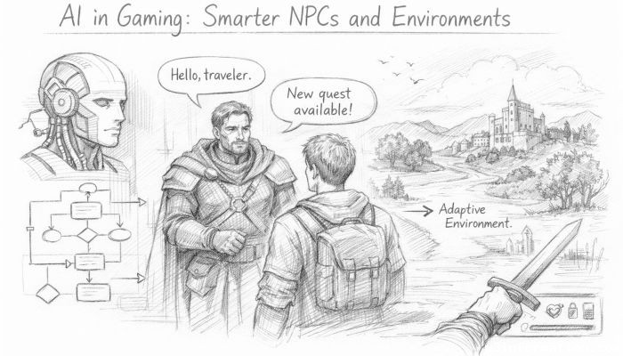 AI in Gaming: Smarter NPCs and Environments
 Understanding Bias in AI Algorithms
 Introduction to Chatbots and Conversational AI
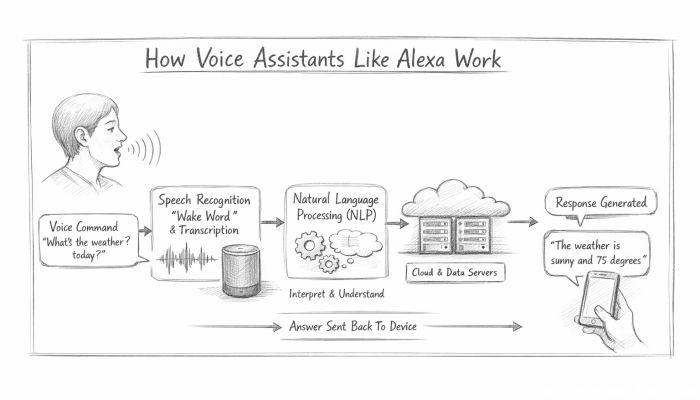 How Voice Assistants Like Alexa Work
 Federated Learning: AI Without Sharing Data